9 visual tools to help you share your quiz data


If you have been using a quiz or a survey within your business, then you have probably collected some valuable data.
Data about your customers, their preferences and their needs.
But what are you doing with that data? How are you using these insights to help your audience and grow your business?
I know what you’re thinking. How interesting is this data? Will anyone even care?
The reality is, that people are always on the lookout for new data, original research and new market trends. This is why your quiz or survey results are so powerful.
BUT… they will only consume your data if it’s presented effectively.
Luckily for you, we have you covered.
In this article, we share 9 tools that will help you showcase your data in a way that’s visually appealing so it helps increase your authority and expertise.
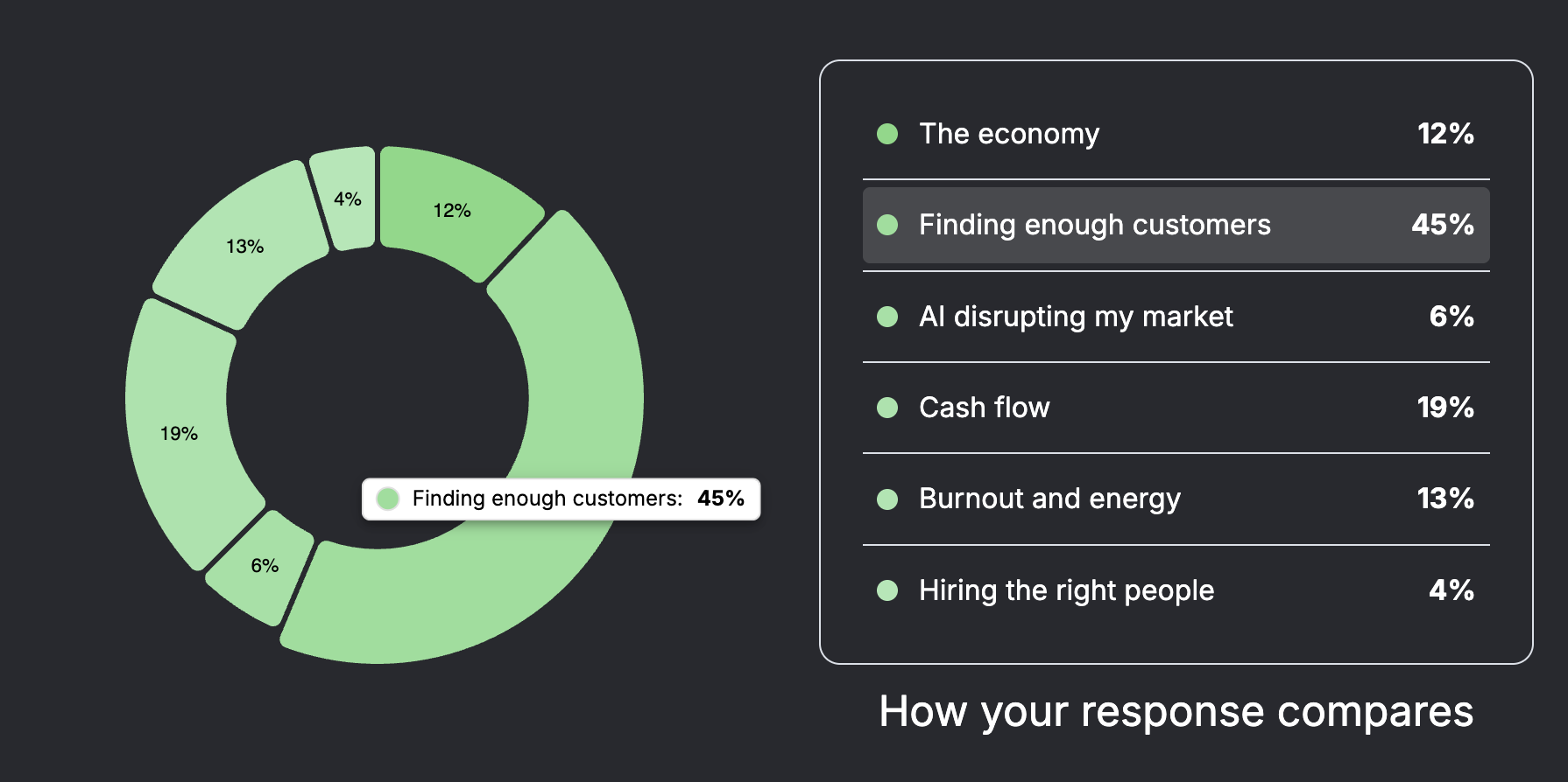
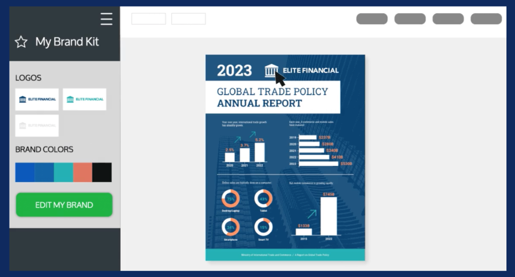
1. Canva graphs and charts
Canva is one of the most popular online design tools, and for good reason; they allow you to create incredible designs using thousands of pre-made templates.
The reason we’ve included them in this list is that they also have several graphs, charts and diagrams that you can use for your own marketing purposes. These templates make it easy for you to add your own data and then share them on social media.

All of the elements within Canva templates can be changed to match your brand such as colours, fonts and style.
The main thing you’ll want to do is to add the data from your quiz. Some of the templates allow you to input specific data such as numbers and percentages and will automatically create an attractive chart that you can download and use within your marketing.
How much does Canva cost?
- Free plan with limited features
- Pro plan – £10.99 per month
2. Visme data visualisation and reports
Visme is an alternative option to Canva and can do a lot of the same things. However, Visme seems to offer more “data visualisation” options.
Their platform has a Graph Maker, which allows you to create over 30 different types of charts & diagrams to display all of the key findings from your quiz. This means you’ll have so many more options when sharing visual content online.
Another reason we like Visme is the option to create reports and whitepapers using the charts, graphs and diagrams you’ve created.

Creating in-depth documents to present your quiz data is an excellent way for you to stand out in your market as an industry expert.
How much does Visme cost?
Free plan with limited features
Pro plan – $29 per month or $12.50 if you pay annually
3. Vengage for Infographics
Vengage is perfect for designing infographics. They aim to eliminate dull documents, and using their tool, you’ll be able to do just that.
There will be times when you need to present lots of data at the same time in one image, this is what infographics are used for.
Rather than provide a bunch of random stats as a written list, you can add that information to a large image and include multiple graphs, charts and diagrams to present your data more effectively.
If you have a quiz or survey and you have collected a list of results with interesting data, then an infographic is the perfect way to showcase these results.
Infographics also tend to get shared more online and also attract a lot of links from other websites. This is why you should consider using an infographic to collate the best findings from your results.
How much does Vengage cost?
Free plan with limited features
Pro plan – $19 per month ($16 per month if you pay annually)
4. Biteable for video data
If you want to present your quiz results and data in a professional video, then Bitable is a great option. Their tool allows you to create data-rich videos using their pre-made video templates.
There’s no question that video is powerful, and when you combine video with data and statistics, it can have a huge impact on your business.
Did you know that users spend 88% more time browsing on websites that have videos, according to Social Media Week.
Example video from Biteable including data
You can use data-rich videos on your website to keep visitors engaged for longer, and you can also use them across all your social media to attract a new audience.
How much does Biteable cost?
Free plan with limited features
Pro plan – $99 per month ($49 per month if you pay annually)
5. JuiceBox for Interactive data tool
If you are looking to create advanced data reports, then JuiceBox might be a great option.
JuiceBox allows you to create a fun and interactive data experience for your visitors. You can take all of the key findings from your quiz results and build a fantastic tool to display on your website.
When you present data in a way that’s fun and interactive, people pay attention. It’s the kind of content that gets shares, comments and links, which all help increase exposure and builds more credibility.

Although Juicebox gives you the option to share the data publicly, you can also choose to keep the data private for internal use. It’s an excellent way to keep everyone in the team up to date with leads, sales and much more.
How much does JuiceBox cost?
Free plan with limited features
Starter plan – $49 per month
6. Better Proposals with added charts and graphs
Did you know that infographics and other colourful visuals can increase sales by up to 80%? (According to Xerox)
You might want to consider that when you’re sending out your next proposal.
Do you include visuals and data throughout your marketing materials? It might be time to start doing this.
A tool such as Better Proposals allows you to create interactive sales proposals for pretty much any industry. Their drag-and-drop framework will allow you to add screenshots, images and text from your quiz or survey.
Better Proposals doesn’t come with fancy charts and graphs like some of the tools we’ve discussed above. However, you can insert multiple screenshots and charts throughout your proposal in order to drive more sales using powerful data from your quiz.
The reason that tools like better proposals are effective is that you can track the specific pages that are viewed and how long people spend on certain sections. This means you can see if your data is converting well or perhaps confusing people.
When you combine sales material with real data from your own research, it can dramatically improve conversion rates.
How much does Better Proposals cost?
$19 per month or $13 per month if you pay annually
7. Pika for beautiful screenshots
If you don’t have time to sit down and learn a new design tool and you just need to share your data fast, then you’re in luck. Pika is a screenshot tool that will make sharing data a breeze. Simply take a screenshot and add it to Pika, and it will automatically place it on a beautiful background for you. It will also add a nice browser window to make it look super high-end.

You can swap between different background patterns and colours to suit you, and you can even add text to the image. Another huge benefit to using a tool like Pika is that it works perfectly on your phone. So if you’re out and about and you have some screenshots you want to share on social media, Pika will take care of it for you.
How much does Pika cost?
Free plan with limited features
Pro plan – $9 per month ($99 per year)
8. Infographia for data-rich slides
If you want to use your data or survey results in a slide deck, how would you do it? Powerpoint? Keynote?
The only problem with that is if you’re starting from scratch, you’ll need to find graphs, charts and information to create the slides.
That’s where a tool like Infographia can help, they have over 3500 slides across 100+ niche examples.

They have slide templates that include editable charts and graphs, which is another reason you don’t want to start from scratch if you can help it. You can take your data from your quiz or survey and use it easily within your presentations, pitches and PDF proposals. Everything can be done using Inforgraphia, so there’s no need for extra tools. As long as you have the data, it’s a piece of cake.
How much does Infographia cost?
From $49 one-time fee
9. PlaceIt for sneak peeks
There may be times you want to showcase some of your quiz data, but not all of it. Maybe you want to tease your visitor before revealing all your findings. In this case, you could use a mockup tool like PlaceIt.
Mockup tools allow you to upload screenshots and snippets from your quiz data onto Laptop screens, mobile phones and iPads. You could use these mockups on social media to promote the quiz data or even on a landing page if you want to collect contact information.

The designs available on PlaceIt are fantastic, and it looks like a genuine photograph with your screenshot on the device.
How much does PlaceIt cost?
From $7.47 per month
How to use your quiz data effectively?
Now that you have 9 amazing tools you can use to share your quiz data, go and try them out. Most of these tools have a free option or a free trial, so you have nothing to lose.
Don’t just collect leads and data and not share it. You have powerful information and key insights that can help your audience.
So don’t waste it.
If your quiz software doesn’t give you enough data, why not try ScoreApp? We have an advanced lead management system that provides extensive data about your leads and their quiz results.
Try today and get a 14-day free trial.