3 Ways Neuromarketing Can Boost Your Waitlist Sign-Ups

Getting people to join your waitlist isn’t just about having a great product. It’s about making signing up feel effortless to your subscribers, while you collect invaluable data insights.
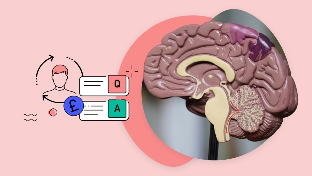
Neuromarketing, which studies how people’s brains react to design and messaging, can help you create a waitlist that grabs attention and gets results.
Here are three simple but powerful ways to use neuromarketing to get more waitlist sign-ups:
- Eye-tracking principles: Knowing where people naturally look helps you place key elements in the right spots.
- Eye-catching design: Using color, contrast, and motion makes your sign-up button stand out.
- Cognitive load reduction: Keeping the process simple stops people from getting overwhelmed and giving up.
With these tricks, you can make your waitlist more engaging and increase your sign-ups with ease.
1. Optimize form layout using eye-tracking insights
Eye-tracking and mouse-tracking are powerful neuromarketing techniques that reveal how users interact with a waitlist landing page, helping you optimize your waitlist sign-up process.
How eye-tracking helps you get more sign-ups
Eye-tracking studies measure where people naturally look first, how long they focus on different elements, and what they ignore. This insight helps you position key elements—the sign-up button, headline, and form—where they’ll be noticed immediately.
Research shows that users tend to follow an F-shaped or Z-shaped scanning pattern, so putting the CTA in these natural eye paths can increase conversions.
Mouse-tracking enters the chat…!
Mouse-tracking analyzes cursor movement, scrolling behavior, and clicks. It provides similar insights by showing where users hesitate, hover, or drop off. If users are pausing in confusion or skipping over the sign-up button, you can adjust the layout to remove distractions, improve button visibility, and streamline the form.
For example, if tracking data reveals that users are frequently hovering over a section but not clicking the CTA, more persuasive copy or a clearer next step may be needed.
By using these neuromarketing techniques, you can create a frictionless, intuitive experience that naturally guides users toward signing up, leading to higher waitlist conversions. Or, you can use ScoreApp, where they’ve already been woven into the design!
Additional business benefit
As we see the demise of third-party cookies, companies need privacy-focused alternatives to measure their campaigns’ successes. Lily’s Kitchen, a premium brand in the Nestlé
Purina family, trialed using eye-tracking audience panels to measure how many seconds they actually spent looking at an ad. Their test campaign increased sales by 20%!
It’s an interesting and successful use of this neuromarketing technology that will only grow in the future. As Associate VP of Marketing at the Kepler Group, Michael Kania, said: “Eye tracking is a unique evolution that might see increasing interest and value as adoption in visual wearables and VR/AR headsets expands. The ability for advertisers to validate or challenge the impact of the second screen and track against true interest could help advertisers establish increased confidence in their creativity.”
2. Use visual saliency to guide attention to the sign-up button

Saliency means something that’s distinct from its surroundings. This can apply to items we detect via any of our senses. Something that’s visually salient stands out when we look at it, so we give it more attention than the items around it.
Why the CTA button matters
The call to action (CTA) button plays a crucial role in guiding users toward conversions, whether it’s signing up for a service or joining a waitlist. Studies have shown that optimizing CTA buttons significantly improves conversion rates. According to HubSpot, personalized and visually distinct CTAs can increase clickthrough rates by up to 202%.
The science bit!
Human attention is naturally drawn to visually striking elements. Factors such as color contrast, motion, and size dictate where users look first and how engaged they remain. By applying neuromarketing principles, you can ensure their most important elements, such as CTA buttons, capture user focus effectively.
You can really concentrate on how specific details affect your target market:
- Button shape: An extensive university study found that rounded CTA buttons get between 17% to 55% more clicks than sharp-edged ones.
- Option to buy different quantities: Broad research into having a range of quantity options on CTA buttons discovered that people were 14% more likely to buy on average, and total sales increased by 28% because people bought more items. For example, Buy 1/Buy 2/Buy 10.
Enhancing CTA visibility for higher conversions
To drive attention and maximize conversions, there is a growing number of techniques available:
- High-contrast colors: Ensure the sign-up button stands out from the background and other text for instant visibility.
- Subtle animations: Use gentle pulses or fade effects to draw the eye without distracting from the user experience.
- Directional cues: Elements such as arrows, eye-tracking imagery, or gaze-triggered interactions naturally guide users toward the CTA.
How ScoreApp waitlist templates optimize sign-ups
Creating a successful waitlist requires strategic placement and emphasis on the CTA button. ScoreApp’s waitlist templates are designed with these principles in mind, incorporating high-contrast elements, pre-tested button placements, and engagement-boosting visual cues.
Instead of spending time testing designs, or hiring a specialist, ScoreApp’s templates do the hard work for you. They’re crafted to keep users engaged, reduce distractions, and make signing up feel effortless so you can grow your waitlist faster with a design that’s already optimized for conversions.
ScoreApp also makes it really easy for you to A/B test the nuances you want to trial with audience segments. All the lovely tracking data insights are right there for you, so you can keep adjusting the details until it’s perfect.
3. Reduce cognitive load with minimalistic design and intuitive UX

Keep your waitlist landing page and form simple. The less effort needed, the more sign-ups you’ll get. That’s ‘reducing the cognitive load’ of your audience.
Why it works
Ever been overwhelmed by a long form or a cluttered page? Most people have, and it often leads to them giving up. Research shows that the easier something is, the more likely people are to complete it.
For example, in mouse and eye-tracking experiments, people were asked about which type of reward they would choose. Scientists found:
- They put much more effort into answering question 1 than question 32
- Their answering strategies became simpler the more questions they answered
- The quality of answers peaked at between 5 and 8 questions.
How to make waitlist sign-ups effortless
It’s easy to scupper your chances when you’re creating waitlists—there are lots of potential mistakes. The best thing to do is take a step back and look at it from your customer’s perspective and:
- Stick to the point: Don’t ask too many questions. We know why!
- Focus on one offer: One waitlist landing page, for one waitlist sign-up opportunity, for one offer. Clean and clear—everything else needs a different home.
- Keep instructions clear and concise: Short, simple messaging reduces confusion.
- Use familiar design elements: A design that feels intuitive prevents hesitation and makes the waitlist part of the customer journey as smooth as possible.
How ScoreApp’s waitlist templates help you get more sign-ups

Setting up a waitlist? ScoreApp’s templates are built to make sign-ups easy and effective, using all the best design, buyer psychology, and neuromarketing tricks. Here’s what makes them work:
- Eye-catching CTA buttons with optimized placement and high-contrast colors.
- Clean, professional layouts that keep users focused on signing up.
- Progressive form fields to reduce friction and encourage completion.
- Built-in survey tools that collect valuable user insights without feeling like a chore.
- Mobile-friendly design so people can sign up easily from any device.
With ScoreApp, you don’t have to become a neuromarketing expert—our templates include all the best practices for maximizing conversions and growing your waitlist fast.