9 Quiz Landing Page Tips to Increase Conversions


Using a quiz funnel within your marketing strategy is an excellent way to build a list of warm leads. It’s interactive and fun, and people get to see their personalised score at the end.
However, your quiz will only be successful if you can get people to take part and hand over their contact information.
Yes, your quiz might be free, but you’re still asking people to hand over their data and their time (even if that time is just a few minutes).
This means you have to sell your quiz.
This is where your landing page comes in.
Your quiz landing page could be the difference between your quiz succeeding or not.
Quiz Landing Page Video
In this article, I’m going to tell you exactly how to create the perfect landing page for your quiz.
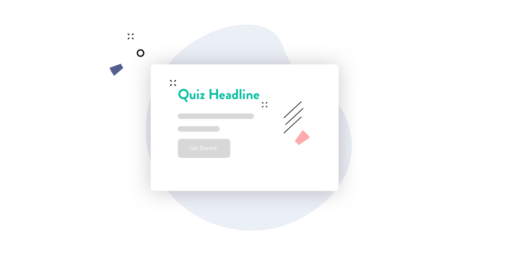
1. Get Your Quiz Headline Right
Your main headline is one of the most important elements of your landing page, and if you want more people to take part in your quiz, it’s essential you get this right.
Your quiz headline will be the first thing your visitor will see, and in those first few seconds of landing on your page they’ll need to understand EXACTLY what your quiz is about.
We won’t lie, writing your headline can be tricky and you’ll probably write a few versions before you decide on the final one! But here are some tips to help you:
Make the quiz headline clear and simple to understand
People need to fully understand what your quiz is about by reading your headline just once. If they don’t understand or have to go back and keep reading it, you’ll lose them. So make it super clear what you cover in your quiz. Your main headline is not the time for fancy, fluffy language.
But make it sound interesting!
It can be tricky to make your main headline clear but at the same time be interesting. But if you can get the balance right, it does pay off.
A trick we like to use is sprinkling in some power words into our copy and the main headline too. Power words are words that grab people’s attention.
Examples of power words
- Discover
- Uncover
- Free
- Surprising
- Shocking
- Epic
- Powerful
For instance, let’s say you want to call your quiz ‘Financial Health Score’. Imagine instead if you used ‘Discover your Financial Health Score.’ That one simple word makes a huge difference.
You don’t always have to use the word quiz or scorecard on your landing page
Controversial, right?
Of course, often the word ‘quiz’ works well. It sounds fun and interactive, but sometimes (particularly for some industries) other words may work better. Words like:
- “Check” e.g. get your Financial Health Check
- “Report” e.g. get your SEO Report
- “Score” e.g. get your LinkedIn Profile Score
- “Action plan” e.g. get your Financial Success Action Plan.
Have a play around with these words, and you may just find that something works better than “quiz” or “scorecard”.
Make your quiz headline stand out
Finally, make sure your headline is big and bold. You want someone to arrive on your landing page and read your headline before they do anything else.
If you want to catch someone’s attention fast, make sure your main headline is the largest text on the page. This would normally be at least twice as big as the text below. If you aim for a text size of 40-60 pixels then you should be ok.
2. Make your sub-heading convert
Your sub-heading is where you really SELL your quiz. You’ve just used your heading to tell your audience what your quiz is about and pique their interest. Now your subheading has to pack a punch!
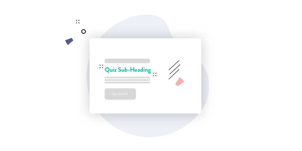
Here are some tips on how to create the perfect subheading that gets people to sign up to your quiz.
Tell people how long your quiz will take
A selling point of your quiz should be how little time it takes. People are generally “time-poor”, especially when it comes to giving their time away for something that is free. So mention here how long it takes, for example…
“It takes less than 2 minutes to get your score”
Mention it’s free
Oh hello. Free, did you say? Yes, it’s always good to point this out. It may seem obvious to you but it can grab someone’s attention. So mention that it doesn’t cost them anything at all.
Give them one key benefit
One of the hardest parts of crafting your subheading is thinking of one key benefit of taking your quiz. Of course, there are lots of benefits but just focus on one main one for your subheading.
Let’s see it in action!
Using the example above, your heading and subheading could look like this:
Main heading: Discover your Financial Health Score
Subheading: In just two minutes you can uncover your free, personalised financial health score which will show you if you can retire 5 years (or earlier)
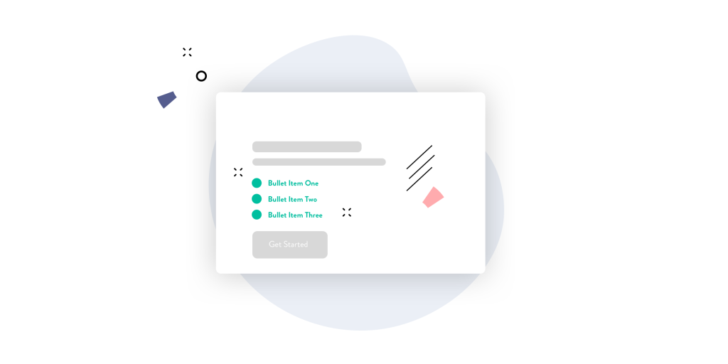
3. Bullet points to satisfy those skim readers
Bullet points give your website visitor a quick snapshot of the benefits of taking your quiz. You may find that you repeat yourself a little from what you put in your subheading, but that’s okay!
People don’t read every word of your page like you do. In fact, studies show people only read 20% of a web page.
Here’s how you can put together a simple bullet point section.
- Tell them what they’ll do
- Tell them what they’re scored against
- Tell them what they leave with
Almost like it’s a three step process.
Tell them what to do (and be specific!)
Tell your web visitor what they need to do first. For example, how many questions they need to answer before they get their results. Just a head’s up: if it’s 100 questions your quiz is way too long! And if you’re struggling with how to put your quiz together, check out our blog post.
People want to know what the next steps are in the process so they feel comfortable going ahead. Don’t just say it doesn’t take long, or there aren’t many questions–the more specific you are, the more trustworthy it is and consequently how much more likely they will continue to fill it in.
Highlight the categories they’ll be scored against
Tell your website visitor how many categories they’ll be scored against. This shows them your quiz is comprehensive and advanced. This isn’t just a fun thing to do. They’ll actually be scored against a number of things.
If you’re struggling to find software that scores your users for different categories, check out ScoreApp–it’s our speciality.
What they’ll leave with
What is the big benefit to them taking the quiz? Tell them.
How will the quiz change things for them? Tell them.
Finally, explain what they’ll leave with once they take your amazing quiz. What is the big benefit to them, and how will taking the quiz, change things for them?
This is a hugely important step, and could be the thing that sells your quiz to your website visitor.
Let’s see it in action!
Main heading: Discover your Financial Health Score
Subheading: In just two minutes you can uncover your free, personalised financial health score which will show you exactly how you can retire in 5 years (or earlier)
Bullet points:
- Answer just 18 questions (which takes under two minutes)
- Get scored against the 5 essential elements you need in place to retire early
- Get a comprehensive report which tells you exactly how to improve your finances so you can retire quicker than you ever imagined!
You see how this is shaping up to sound like a fantastic quiz? We want to take our made up quiz now!
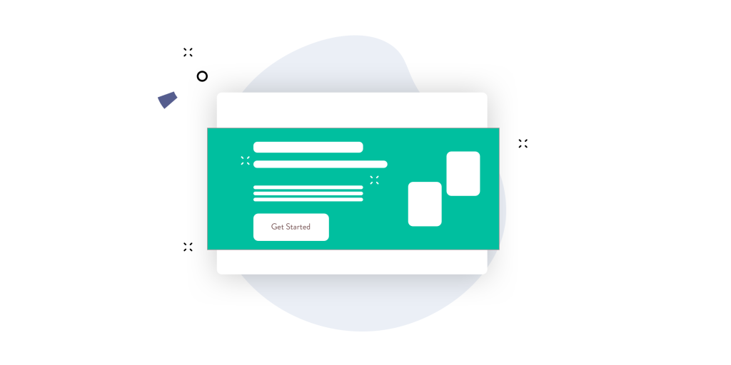
4. Call to action button
The main call to action button on your quiz landing page (i.e. the button people click to take your quiz) is hugely important.

Yes, you might think to yourself, ‘it’s just a button, what’s the big deal?’ But this button has to be utterly irresistible to your website visitor. The easier you make it to find and click on the better.
Here are some simple actions you can do to make your website visitors click on your button on autopilot.
Make it stand out
Make sure your call-to-action button is immediately visible when someone arrives on your landing page. You don’t want someone having to scroll down the page to find it.
Secondly, and yes, this may sound daft but a lot of people get this wrong: make it a button! Not just a link within some text. Create a big button that is obvious you’re meant to click on it.
Make it a bold colour
Buttons aren’t for looking nice and blending in. They are there to grab your website visitors’ attention. So choose a bold colour that stands out. There’s a lot of research that’s been done regarding the “optimum button colour” you should use on landing pages, but don’t over complicate it. Just pick a colour that stands out on the page.
Use action driven copy
Don’t just use ‘find out more’ or “click here” as your button copy, say something that will really grab the interest of your website visitor. This could be, ‘Get your score instantly’ or ‘Get my report now’.
This is way more appealing to your website visitor and reminds them what they’ll get if they fill in the quiz.
5. Hero image
The hero image is the image that sits at the top of your landing page. It’s the first thing people see when they land on your page for the first time.
The main landing page image sets the scene for the page and makes your visitors know they’re in the right place.
Images are super important and help build trust and credibility with your audience. The question is, what type of image do you choose? Below are two types of images you could include on your quiz landing page.
Stock Images (Topic based)
Stock images are usually the easiest and quickest way to add visual elements to your landing page. There are lots of free stock image websites you can use and even the paid images are still very cheap.
It’s easy enough to find images based on what you do for instance:
- An accountant could find an image of a desk with a calculator
- An architect could include a nice image of a house in the background
- A web agency could use an image of a laptop in the background
The trick with using standard stock images like these is to make sure it doesn’t distract your visitor from the main focus of the page i.e. The copy and call-to-action.
You could include an image related to your quiz
Quiz related images tend to convey what the text is all about. So you could show a report, or a computer with a score inside it (to convey the score element of the quiz).
These kinds of images are a good option because your website visitor can understand the page much faster. The phrase “a picture speaks a thousand words” is true. And if your website visitor is spending less time figuring out what your page is all about, they’re more likely to click on your quiz.
An image of you
Alternatively, you can include an image of yourself on this page. This builds trust and credibility as your website visitor can see the person behind the quiz, rather than some faceless organisation trying to get a new lead.
Play around with it and see what works. We personally prefer the images where you showcase what your web visitor is going to get, e.g. the report or score. BUT, particularly if you have a strong personal brand, you might want to feature an image of yourself instead.
6. Include Testimonials on your Quiz Landing Page
Did you know that 72% of consumers say positive testimonials and reviews increase their trust in a business?

Yes, people taking your quiz aren’t buying from you (yet!) but they are handing over their contact information and answering your questions. So there needs to be some element of trust there.
Using testimonials increases trust with your audience and more importantly, helps increase conversions. This is why you’ll certainly want to include testimonials on your quiz funnel landing page.
Make them about your quiz and not your company
You probably have tons of testimonials about your company and the amazing things you’ve done. And that’s great. But, your quiz landing page is not the place for these. Your landing page testimonials should be specifically about your quiz and how someone has benefited from taking part.
All they want to know is whether this quiz is worth their time and effort to justify handing over their contact details.
Make them outline the benefits
Don’t just have a testimonial that says ‘I really enjoyed taking this quiz!’ Instead, get those who are providing your testimonials to outline the benefits. This could be something like ‘I finished the quiz with an action plan to help me save £500 per month!’
The problem is, how do you get such good testimonials like this?
Make sure you ask the person giving you a testimonial various questions that will get you some fantastic answers.
Things like:
- What were you confused about before you took the quiz?
- How did the quiz help you in this area?
- What have you learnt from the quiz?
- What did the quiz give you when you filled it out?
Yes, some of these questions sound repetitive, but you’ll get some really good comments out of it!
Get a photo, name and title
Displaying testimonials without a name and a photograph can often lack credibility. “Is that are real person or have you just made that up?” People may think is this testimonial from an actual person !
If possible, get the person giving you their testimonial to approve using their name, a photograph of themselves (you can usually get this for them if you Google their name!) and their title or company. This builds even more trust and credibility.
7. Display bonuses on your quiz landing page
Have you considered adding a bonus for people who take your quiz? This means you’re giving even more value to your website visitor, quickly building more trust and credibility.
If you do have some bonuses to give away, make sure you display these clearly on your quiz landing page too! This will encourage more people to take your quiz and in increase your conversion rate.

How to present the bonuses on your landing page
How you present your bonuses is very important. You want your leads to know that the bonuses are valuable and beneficial for them.
There is a right way and a wrong way to do this.
The wrong way
“Get a free bonus when you complete the quiz”
This is vague and doesn’t really feel valuable or helpful in any way.
The right way
“If you take the quiz today, you’ll receive a free copy of my book which is worth £20!. This book will help you…’
This makes it sound super valuable and beneficial to your visitor, they might even be more interested in the bonus than the quiz.
Include an image of the bonus
Showing a picture of what the bonus is will always make your visitor more interested and should help increase conversions. As we mentioned above, a picture really does paint a 1000 words.
8. Include a simple bio on your landing page
Quizzes are brilliant because they give you so much data. BUT, people are aware of this, and are sometimes reluctant to answer questions from people they don’t know.
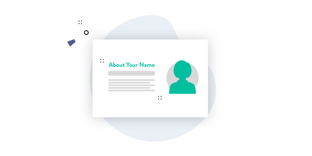
Including a bio that explains who you are and what you do is a great way of breaking down the barrier between you and your website visitor–increasing trust and credibility.
This is also a great place to include a picture of yourself too (if you haven’t already done so in the header section of the page).
Don’t make it too long
Your bio should be a few paragraphs long. This is not the time for lengthy explanations about when you started and your entire history to date. Keep it short and sweet.
How does your bio relate to the quiz?
You may have done many things and you might have a lot to say, but try to keep your quiz landing page bio on the topic of your quiz.
For example if your quiz is about financial planning, don’t talk about your favourite hobbies or sports. Talk only about your experience that relates to what your quiz is all about.
9. Show Awards and Accreditations
For ultimate trust-building, make sure you include your awards or places you’ve been featured. This helps convey that you’re credible and trustworthy.

Just feature logos
There’s no need to talk about this at any length, simply include the logos from the awards you’ve won or places you’ve been featured, such as the BBC logo.
Reduce the size of those logos!
Make sure you reduce the size of your logos. Anything too large and heavy could slow your page down and impact user-experience. Try to do this with all your images to keep your website nice and speedy.
You can use a tool like TinyPNG to help reduce images sizes. Simply upload your images to this site and it’ll do the rest!
The first step in designing your landing page
We understand how designing a landing page like this could take you a long time. That’s why we’ve worked hard to include pre-built landing page templates in our quiz software. We want to make it as easy and simple as possible for you to get leads from your quiz.
Click here to have a look at our templates, or if you already checked out this page then click here if you’d like to learn more about ScoreApp.