Full scorecard analysis in one click, AI Insights just landed

Good decisions come from good data. Fast decisions come from someone having already read it.
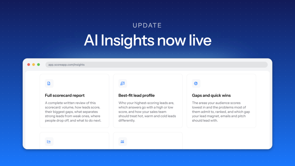
That’s what the new AI Insights page does. It sits under Insights in your scorecard, holds a set of ready-made analysis reports, and turns your live responses into a written breakdown – who your best-fit leads are, where people drop off, which gap to fix first – at the press of a button. No spreadsheet, no afternoon set aside, no working out which question to ask first.
Your scorecard is quietly building one of the most valuable assets in your business: honest answers from real prospects about what they need, what’s holding them back, and how ready they are to buy.
The question was always what to do with it next. Reading across hundreds of responses, spotting the pattern, and turning it into a decision is genuinely useful work – and it’s the work that gets bumped every week by something more urgent.
What AI Insights actually does
What changed: There’s a new AI Insights page under Insights, holding a library of ready-made analysis prompts. Choose one, edit it if you want, and our AI generates a detailed written report on your scorecard’s live data.
Until now, insight meant knowing what to ask. The Insights dashboards showed you your numbers, but turning “average score is 62%” into “here’s the gap costing you conversions, and here’s the change to make” was a job you did yourself – if you got to it.
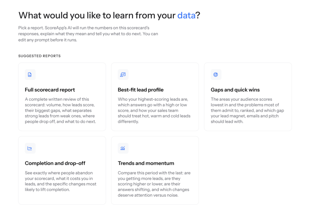
AI Insights removes that step. Five suggested reports cover the questions most businesses want answered:
- Full scorecard report – a complete written review: volume, how leads score, their biggest gaps, what separates strong leads from weak ones, where people drop off, and what to do next.
- Best-fit lead profile – who your highest-scoring leads are, which answers go with a high or low score, and how your sales team should treat hot, warm, and cold leads differently.
- Gaps and quick wins – the areas your audience scores lowest in and the problems most of them admit to, ranked, and which gap your lead magnet, emails, and pitch should lead with.
- Completion and drop-off – exactly where people abandon your scorecard, what it costs you in leads, and the specific changes most likely to lift completion.
- Trends and momentum – this period against the last: more leads or fewer, scoring higher or lower, answers shifting, and which changes deserve attention versus which are noise.
And because every prompt is editable, you’re not limited to those five. You can ask your data anything – which is where this gets interesting.
A real example: how we restructured a webinar in one click
Here’s one we ran on ourselves last week.
We have a scorecard collecting registrations for an upcoming webinar on the AI Builder. One of the questions asks:
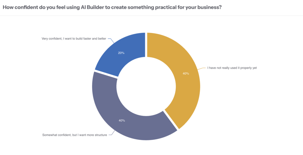
How confident do you feel using AI Builder to create something practical for your business?
The answers were split three ways:
- 40% – “I have not really used it properly yet”
- 40% – “Somewhat confident, but I want more structure”
- 20% – “Very confident, I want to build faster and better”
Useful to know. But knowing the split doesn’t tell you how to run the session – and a webinar pitched at the wrong level loses half the room in the first ten minutes.
So instead of picking a preset report, we edited the prompt:
Can you look at the responses for the question: How confident do you feel using AI Builder to create something practical for your business? And come up with a segment in the webinar that addresses each group helpfully.
Here’s what came back.
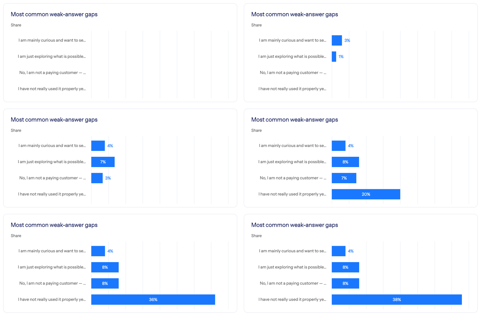
First, how to handle the room:
“Rather than separating the room too rigidly, the host could say something like: ‘I know some of you are brand new, some have tried this and want more structure, and some want to move faster and get better results. So I’m going to teach this in three layers: how to start, how to structure, and how to optimize.'”
Then a segment structure to match – “How to use AI Builder at your stage”, in three layers:
- Start – for people who are new. Show the simplest path from idea to first draft.
- Structure – for people who have tried a bit already. Show how to strengthen concept, prompts, and question flow.
- Optimize – for more advanced users. Show how to move faster, refine outputs, and improve quality.
And then the part that actually changed our plan – where to put the weight:
Because 80% are not yet fully confident, the webinar should lean toward clarity over complexity, process over theory, practical examples over abstract explanation, and progress over perfection.
The advanced group still matters, but they are the smaller segment, so their needs are best handled through short optimization tips throughout, one dedicated “faster and better” section, and live refinements rather than basic setup alone.
That’s a running order, a framing line for the host to open with, and a clear instruction on where to spend the time – from one question, one edited prompt, and one click.
Note what it didn’t do: it didn’t tell us to build three separate webinars, or to ignore the 20%. It read the balance of the room and made a judgment call about how to serve all three without fragmenting the session. That’s the difference between a chart and an analysis.
Why it matters
You get the analysis a good data person would give you, without needing one. For most businesses, proper response analysis never happens – not because it isn’t valuable, but because it’s always the thing that gets bumped. Making it a one-click job changes what’s realistic. Analysis you’d do once a year becomes something you do after every campaign.
The conclusions are yours, not generic best practice. Every report is grounded in your own zero-party data – the answers real people gave you. So you’re not applying someone else’s benchmark to your audience. You’re reading your audience.
It ends in a decision, not a chart. Our webinar example didn’t return a percentage split we already had. It returned a running order. That’s the bar: something you can act on the same day.
It’s honest about what it can and can’t see. Where a sample is small, it says so and tells you how many people a figure is based on. You won’t rebuild a scorecard on the strength of two responses.
Other ways to use it
The webinar example is one use. A few more worth trying on your own data:
- Run Gaps and quick wins before writing your next campaign, and lead your headline with the problem most of your audience actually admits to.
- Run Completion and drop-off and fix the single question costing you the most leads – usually one edit away.
- Run Best-fit lead profile and give your sales team the one answer that best predicts a strong lead.
- Edit any prompt to ask about a specific question, segment, or campaign – as we did above.
How to use it
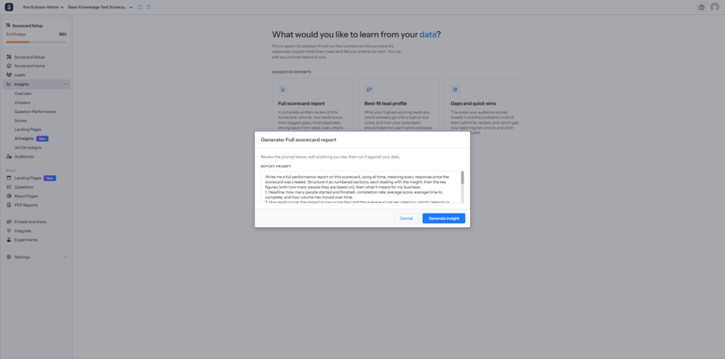
Go to Insights › AI Insights in your scorecard. Pick a report card, and a window opens with the prompt already written. You can run it as-is, or edit it – add context about your business, narrow the date range, ask it to focus on one category. Then press Generate insight.
A new AI chat opens and writes up the analysis, charts included. Because it’s a chat, you can keep going: ask it to break a finding down by category, compare against last quarter, or explain how it reached a conclusion.
ScoreApp’s AI Insights is available on the Business plan and above.
What’s next
This is the first step, not the finished picture. Right now AI Insights tells you what’s happening and what to act on. Next, it will start suggesting the specific changes to make – updating a landing page, rewriting a question – and take you straight to the place you make them.
Less time working out what your data says. More time acting on it.
If you’re on Business or above, AI Insights is live in your account now.
Log in and take a look at ScoreApp’s AI Insights tool →